I’ve been working on support for natively showing suitable images for high-DPI displays in MediaWiki, starting with basic content images.
On desktops and tablets there’s just a few devices like the Retina MacBook Pro that need this, but in the mobile world there are loads of devices at 1.5x or 2.0x the traditional resolutions.
You can see a live demo of this patch in action on these test articles:
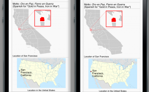
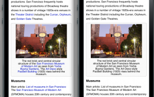
Here are some screenshots from an iPhone 5 simulator showing fragments of the San Francisco Wikipedia article as currently displayed on en.m.wikipedia.org and with my responsive images patch…
These maps are absurdly sharper on the right side:

And this photograph is visibly much sharper on the right, showing detail of the building’s texture and patterns that wasn’t previously visible without clicking through to the detail page:

The current version of the patch uses the ‘srcset’ attribute as defined in the current HTML 5 working group version, only using the density options and not the width/height options. Since browsers don’t yet support this, I also include some JavaScript to check the display density and load the appropriate image from the srcset.
Patch in gerrit:
The current version has been tested with a number of devices and browsers, including:
- iPhone 3Gs, Safari (low-res 1x)
- Nexus One, Android browser (medium-res 1.5x)
- iPod 5th-generation, Safari (high-res 2.0x)
- Galaxy Nexus, default browser (high-res 2.0x)
- Galaxy Nexus, Chrome (high-res 2x)
- Galaxy Nexus, Opera Mobile (high-res 2x)
- BlackBerry 10 dev alpha, default browser (high-res 2x)
And on a Retina MacBook Pro:
- Mac OS X, Safari (2x)
- Mac OS X, Chrome (2x)
- Windows 8, IE desktop (2x, with desktop zooms set to 200%)
- Windows 8, IE Metro (2x)
and on an 11″ 1366×768 Windows 8 tablet:
- Windows 8, IE Metro (1.5x)
Currently unsupported:
- Opera Mini (we don’t serve any JS)
- Firefox (can’t yet detect resolution)
- Windows Phone IE (can’t yet detect resolution)

