Wikipedia new Android, iOS apps in development: current demo

Latest demo screencast of Android and iOS new Wikipedia mobile apps in development — now with login and basic editing! I think folks are really going to like what we’ve done once we get these polished up and out in the stores replacing our old mobile app.

If the on-wiki embedded video player doesn’t work for you, try a mirror on YouTube.

Thanks to Android 4.4’s built-in screen recording feature this didn’t require any custom hardware kit to record, but I had to jump through some hoops to edit it in PiTiVi… I’ll write up some notes on-wiki.

Screencasts of mobile devices with HDMI capture

When trying to post about behavior of web or mobile applications, a picture is worth a thousand words… but a video can be worth a thousand pictures. Videos can capture complex behaviors that are hard to fit into a screenshot, can be narrated, and show actual performance as well as the look of something.

Here’s a screencast of the upcoming Wikimedia Commons app importing a PDF from Keynote on an iPod Touch:

I’d stumbled upon some references to a performance monitoring tool called Eideticker that Mozilla’s using for the Android version of Firefox. This uses an HDMI video capture card to record live video output from a Galaxy Nexus or other phone, and can then mark timing of various on-screen events down to 1/60 second precision.

‘Blackmagic’, the company that makes the PCIe card Mozilla uses, also makes Thunderbolt-connected standalone widgets that are easier to connect to a MacBook Pro. I picked up the “Intensity Extreme“, which hides the (for me) unneeded analog video ports behind a breakout cable that I can stuff in a drawer.

See details on which devices I’ve gotten to work and more sample casts.

Limitations:

  • Capture works in their utility program and various high-end editing programs via plugin, but it doesn’t appear as a camera to other apps. So it’s not ideal for live screencasting on a Google Hangout or such, but could probably be pressed into service.
  • Captured video is uncompressed, so files are large!
  • No 1080p60 capture — they have a higher-end model that can do this, but I didn’t shell out the dough. Most devices I’ve tested output at 720p60 or 1080p30 though, so that’s not a problem.
  • No autodetection of the resolution — you have to pick the right resolution in the capture utility, possibly by trial-and-error.
  • No passthrough for the Thunderbolt connection.
  • Must purchase HDMI and Thunderbolt cables separately. :)

Retina display support landed in Firefox nightly

Firefox bug 674373 has landed; Firefox nightly builds now natively support the Retina MacBook Pro display!

It also now supports the window.devicePixelRatio interface which my in-progress high-DPI image support for MediaWiki uses to determine which resolution images to load. It looks great on my Retina MacBook Pro! This should land in the final Firefox 18 release in a couple months for those not on the bleeding edge of the upgrade treadmill.

Unfortunately there’s a bug which causes window.devicePixelRatio to report an incorrect value on Android, so hi-dpi support for Firefox mobile is slightly broken pending bugs 794056 and 779527.

Responsive images for high-DPI displays in MediaWiki

I’ve been working on support for natively showing suitable images for high-DPI displays in MediaWiki, starting with basic content images.

On desktops and tablets there’s just a few devices like the Retina MacBook Pro that need this, but in the mobile world there are loads of devices at 1.5x or 2.0x the traditional resolutions.

You can see a live demo of this patch in action on these test articles:

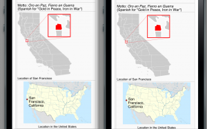
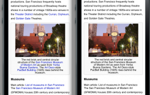
Here are some screenshots from an iPhone 5 simulator showing fragments of the San Francisco Wikipedia article as currently displayed on en.m.wikipedia.org and with my responsive images patch…

These maps are absurdly sharper on the right side:

And this photograph is visibly much sharper on the right, showing detail of the building’s texture and patterns that wasn’t previously visible without clicking through to the detail page:

The current version of the patch uses the ‘srcset’ attribute as defined in the current HTML 5 working group version, only using the density options and not the width/height options. Since browsers don’t yet support this, I also include some JavaScript to check the display density and load the appropriate image from the srcset.

Patch in gerrit:

The current version has been tested with a number of devices and browsers, including:

  • iPhone 3Gs, Safari (low-res 1x)
  • Nexus One, Android browser (medium-res 1.5x)
  • iPod 5th-generation, Safari (high-res 2.0x)
  • Galaxy Nexus, default browser (high-res 2.0x)
  • Galaxy Nexus, Chrome (high-res 2x)
  • Galaxy Nexus, Opera Mobile (high-res 2x)
  • BlackBerry 10 dev alpha, default browser (high-res 2x)

And on a Retina MacBook Pro:

  • Mac OS X, Safari (2x)
  • Mac OS X, Chrome (2x)
  • Windows 8, IE desktop (2x, with desktop zooms set to 200%)
  • Windows 8, IE Metro (2x)

and on an 11″ 1366×768 Windows 8 tablet:

  • Windows 8, IE Metro (1.5x)

Currently unsupported:

  • Opera Mini (we don’t serve any JS)
  • Firefox (can’t yet detect resolution)
  • Windows Phone IE (can’t yet detect resolution)


High-DPI fun with Retina Display and free software


How to run Linux on Retina MacBook Pro without dual-booting

Linux tends to be a bit flaky on brand-new models, and dual-booting is tough (impossible?) if you want to use FileVault on your Mac OS X partition. But some of us want to peek into the future, and maybe help Linux-based software prepare for the world of high-resolution displays…

Luckily, you can use standard virtualization tools. Unluckily, for now you’ll have to manually change the Mac’s screen resolution.

  1. Get a tool like SwitchResX that lets you set the desktop to 2880×1800 unscaled. You don’t need to switch resolutions yet; install will be easier at a sane res!
  2. Install Ubuntu or whatever into VirtualBox or other virtualization software
  3. Within Linux, install the ‘gnome-tweak’ (“Advanced settings”) tool
  4. Open up ‘Advanced settings’ and bump ‘Text Scaling’ up to 2.0
  5. Switch to 2880×1800 and go fullscreen!
  6. After leaving, switch resolution back to sane 1440×900 (HiDPI)

This trick works with games like Portal 2 as well. :)

This may also be a good way to run things like Gimp and Inkscape at high-resolution, since X11.app/XQuartz doesn’t yet support HiDPI mode.

Unfortunately, today things are a nasty mix of font-dependent good sizing and pixel-dependent horrible scaling. Boo hoo :( GNOME Shell seems to fare better than Ubuntu’s Unity interface, but it still not perfect. Firefox has UI mostly sized to text, but then you get tiny icons and actual web pages default to tiny scale.

Possibly adjusting screen DPI could help some of these, but not sure…

BugTender updates

Can now post comments on bugs! Auth prompt at post time. No offline queuing yet.

Bug list defaults to showing recently filed bugs. Various search and sort options, incomplete but a start. Doesn’t handle huge return lists well; server gives chronic order oldest first, we want the opposite.

Initial appcache for offline usage. Limited as there’s no persistent data cache yet, but you can load the page when offline.

Restructured bug view to put comments first.

More details in bug list items.

20111205-092116.jpg

High-density displays: mobile and beyond

High-density displays are already here on small screens, and should start hitting tablets, laptops, and desktops in the next couple years. Apple’s iPhone 4 and current-model iPod Touch sport a best-of-breed 326dpi display, while lots of Android and Windows Phone devices have an intermediate 240dpi resolution. With the new Galaxy Nexus, Android’s entering the 320+dpi world as well.

The most immediate effect is of course that text renders as sharply on screen as in print. As a web-based application, Wikipedia gets this über-shiny text rendering  “for free”… but for graphics, we’ll have to work a little harder.

Most images you’ll find on the wikis are either largeish raster images that are being scaled down for in-article viewing, or scalable SVG drawings that are being rasterized to PNG on the servers for broadest browser compatibility.

Unfortunately neither automatically takes advantage of a high-density display!

For SVG drawings, we can simply start serving the original SVGs instead of the rasterized PNG images, and they’ll look lovely (images from Gas giant article mobile view, rendered on an iPod Touch, with high-res versions swapped in by this bookmarklet):

We’ll need to make sure we can do this with a good fallback to PNG however — while all major desktop and mobile browsers in their *latest* versions support SVG, there’s still a lot of Internet Explorer users and Android users who can’t view SVG. Some less capable mobile devices may also be unable to handle full SVG (Android is rare among smartphones; SVG support is missing on most Android phones today but is present in Android 3.x tablets and upcoming 4.x phones).

We also need to make sure that file sizes and rendering times are reasonable; large maps might be very expensive to transfer and render client-side when we really only need a small map. See my SVG-Open 2009 slides for some data on PNG vs SVG sizes and the need for work on shrinking files.


Other files are usually available in a size larger than they’re shown on default-density screens, so putting a 1.5-sized or double-sized thumbnail into the same screen space makes it match the screen’s actual density. This is particularly useful for diagrams that were created as raster images instead of SVGs, since they often contain fine lines and text which benefits from the full resolution:

SVG and PNG images used for icons and diagrams are probably the highest-priority for high-density images. Photographic images can also benefit, but usually scale up better than line drawings and text because they have fewer sharp edges to begin with.

For raster images of all types, doing dynamic replacement is extra work; CSS or JavaScript can be used in various circumstances but it can take work to make existing code using <img> tags “just work” without loading up extra versions of images, or loading higher resolutions than you need on other devices.

Math equations are another thing; currently we render most math equations to PNG images (via LaTeX); these also render poorly compared to other text on a high-density display. The best solution for this appears to be to migrate towards client-side math rendering based on the MathJax library; using MathML or HTML and CSS, this system is able to use the browser’s native text rendering much more effectively for math.  Equations rendered this way look stunning at high resolution!